Foto / ČEZ Vinohradská
ČEZ Vinohradská
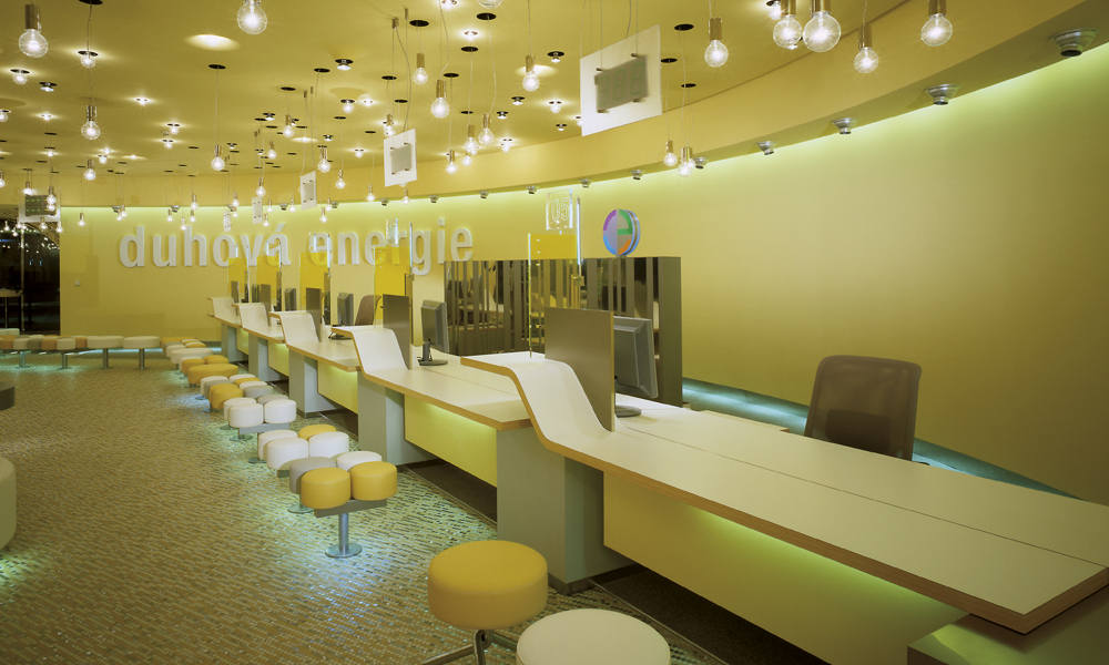
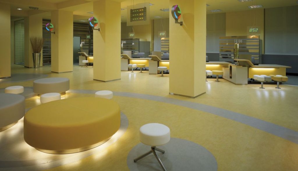
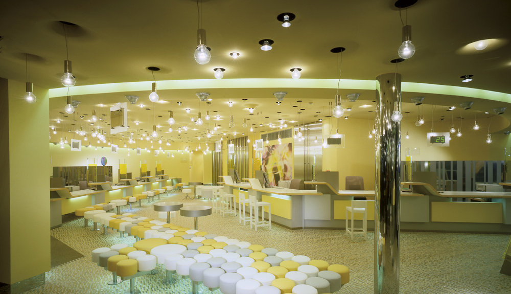
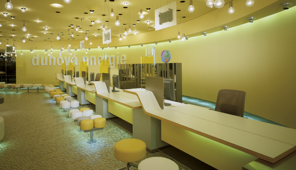
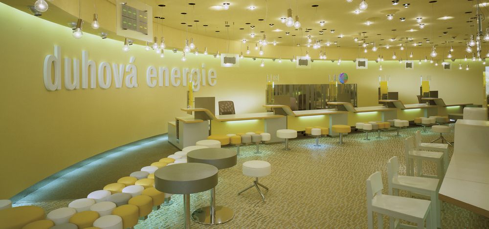
The project begun with a brief – the interior should be a unique space radiating positive energy, not expensive but comfortable place for customers. And designer had three colours to use: yellow, grey and white.
An elegant solution comes from Barbora Škorpilová and the studio Mimolimit. The interior design uses simple unifying elements and principles that thanks to their repetition visually unite the wide network of branches and give them an authentic style at the same time. Beyond that, they tell the company’s story.
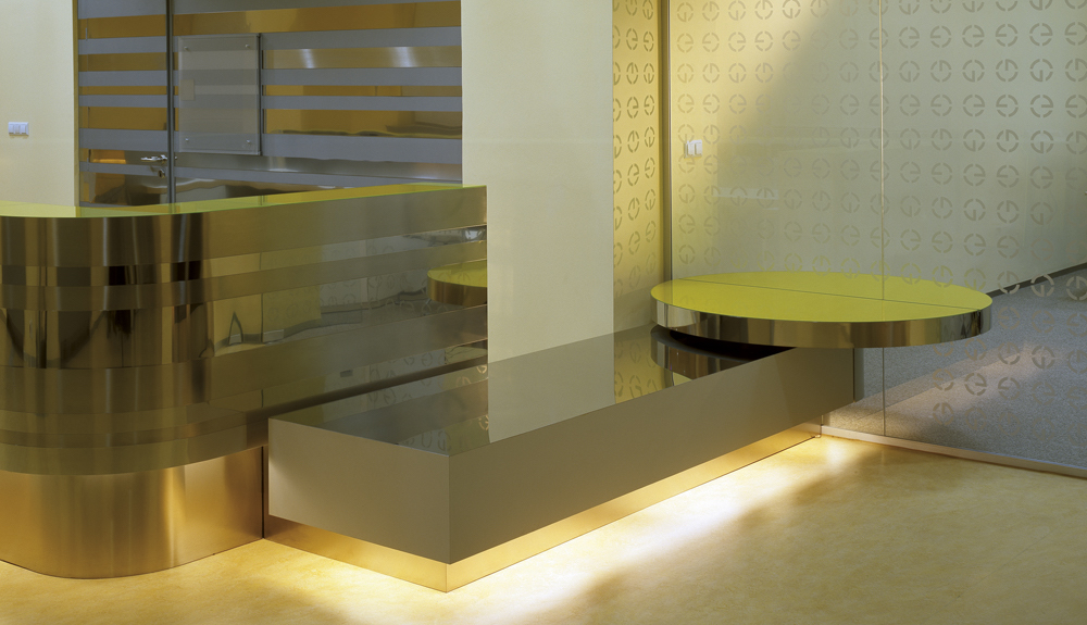
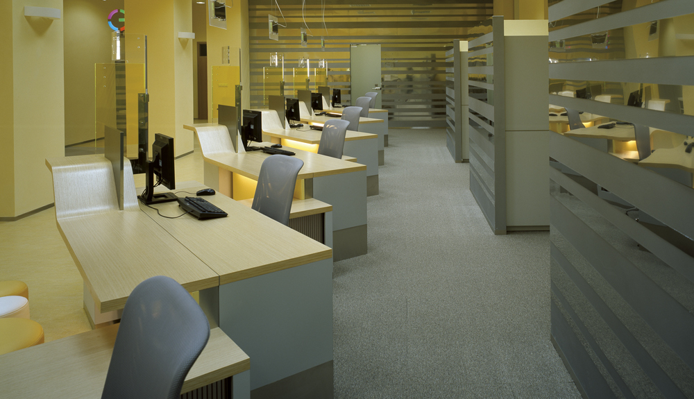
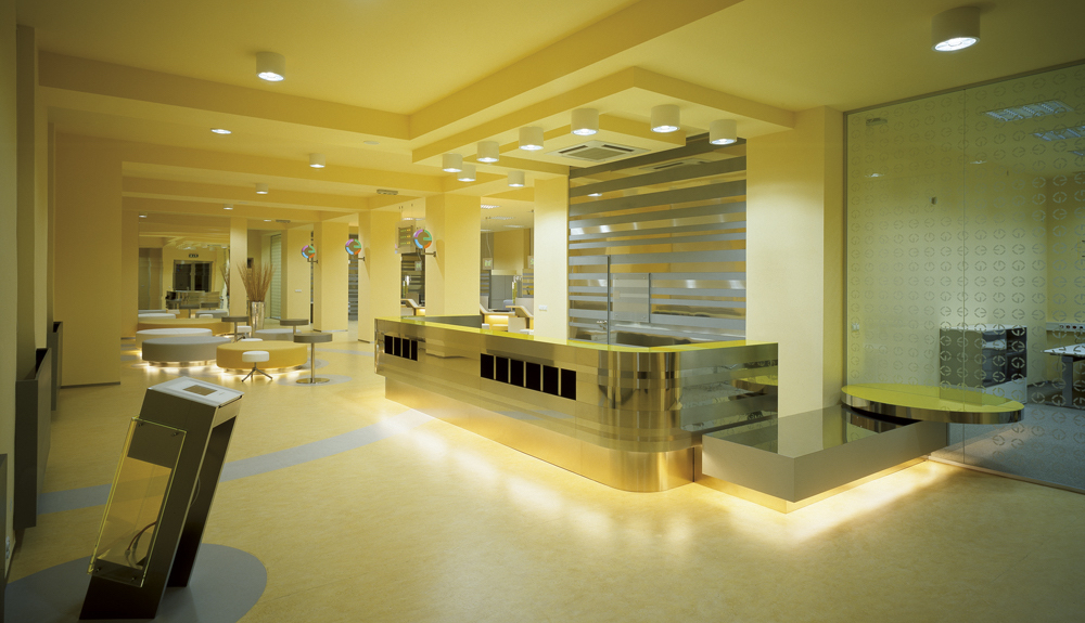
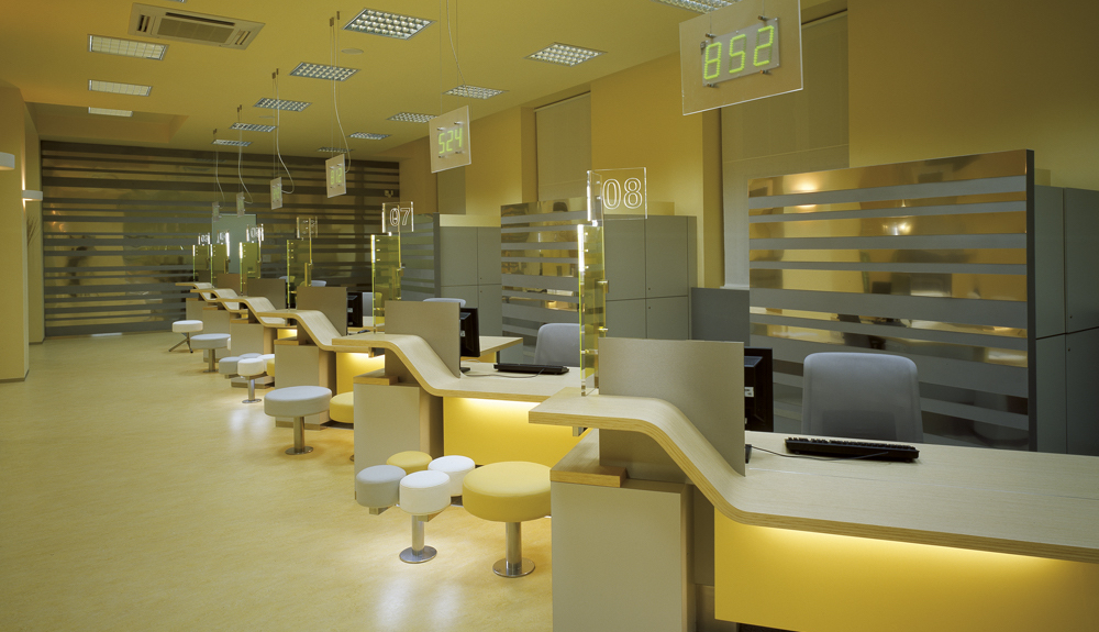
The main motives of all sales points are bulbs, yellow colour and circle – symbols of energy and sun. The energy expressed as a continual flow or movement is present within the interior in the form of a repetitive wavy curve of the tables of all “counters” and the mosaic floor composed of yellow, white and stainless-steel discs. The space is designed as an open hall so that a personal contact of clients and staff is naturally enabled.
A serial production of furniture with the help of casting molds was applied because of the repetition of many identical form and colour components within the space of all outlets of the company. The office interior has an elegant and serious look enhanced by dynamics of simple shapes and modern materials.